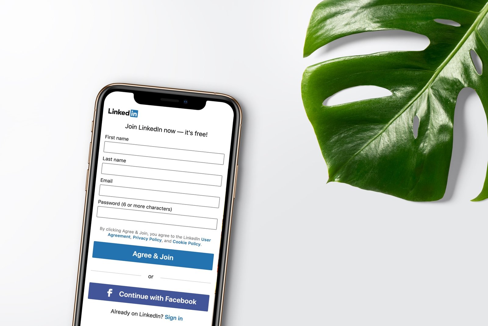
5 Simple Tips to Improve Your Signup Conversion Rate

In this article, I’ll share with you 5 proven and tested ways to improve the conversion rate of your signup page. This is based on my experience of almost 6 years designing and improving digital products for my clients.
Make it visible
Many sites make the CTA nearly invisible. It blends into the background, or it’s identical to other buttons on the page, or it otherwise just doesn’t stand out.

Always keep your main CTA above the fold, make it visible, and experiment with power words, depending on the action. Strong color, placement, and a copy will always perform better than a tiny Sign Up lost between sections and other CTA'S.
Minify your Sign Up Form
People are busy. They have better things to do than spend all day on your website. The goal is to get people to signup, Right? So make it as easy as possible for people to signup.

If an email is enough to create an account, then only ask for email. Once you have the email then you can convert them through unlimited ways.
Need more information from the user like where transactions are involved. Make sure to do it in a multi step form. These type of forms distribute the number of fields over steps making the form seem shorter than it is. Make sure to add plenty of white space in your forms, nothing is more tiring than looking at cramped forms.
Offer an Incentive
People like to get things for free, it makes them feel like they are getting something of value.

This could be in the form of an offer, free trial, a month of free paid subscription, e-book, or any other relevant incentive that provides value. Tap into the psychological drive by offering an incentive to your customers. If you’re offering a new product or service, consider offering an incentive to early adopters.
Allow social signups
Another way to speed up the signup process is by allowing social signups.

If you can integrate your website with social media platforms, users will be able to sign up with just a click or two. By clicking the social icons, they will sign up with just one click if they are already logged into one of those profiles. This also ensures your user is not another spam account.
Provide help along the way
A user may leave a required field incomplete or enter an input wrong. If this happens, you want to make sure it’s corrected as fast and as efficiently as possible. The user obviously wants to convert. They filled out some information and clicked your CTA. Don’t let them leave without completing the process.

If they click on your CTA and nothing happens, they may just assume there is a problem with your website. That’s why you need to clearly highlight incomplete/ wrongly filled fields.
Without this type of alert, someone who made an honest mistake may not understand why they can’t submit their form.

You can even hint at formatting with the ghost text. For example, ghost text for emails that use john@example.com will encourage users to complete the form in that style.
By providing guidance and help in your contact form, you’ll ensure that users are able to make it through to form submission instead of giving up halfway through.
I hope this helped. Share your thoughts in the comments
Join my mailing list
P.S I promise not to be a human spam.